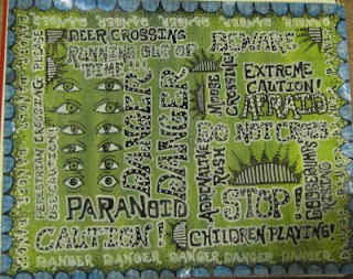
Well I have had a little bit of time to work on my sketchbook for my Danger Danger theme. My book has arrived with the due date for December 1st. That gives me 10 days to work on 20 2page spreads. I have finished four pages. This particular page I was able to work on while I volunteered for the program "Inn From The Cold". My Church hosts one night for this program to house 15 homeless people. My hubby and I volunteered for the first time the other night and I had the first part of the night to stay awake for five hours. I was able to work on this page during that time.
I set up the page before I left by painting it with my H20 Twinkling watercolors in Green. Then I cut out the border from a magazine with a lot of text on it and painted it with blue H20. Once dried I outlied the border in black sharpie and adhered to the green page.
I used a white and a black poster paint pen for the lettering.
This was a very mind numbing but fun page to do as I practiced my lettering styles.
Hope you enjoy.
Happy creating everyone!


7 comments:
It looks great Kelly! Gives me a sense of... danger. Like watching the evening news, LOL. Your lettering is cool too!
Oh and the deadline has been extended to January 4 2010. So don't panic ;-)
It turned out great. I love the colors and it's much different than the other page you've done. You don't have much time. I am so glad I didn't join in. I'd be stressed out so much my creativity would have gone into hiding! Do take care so that pneumonia doesn't come back.
That's a very nice thing your church is doing for the homeless. See, there's that goodness I was talking about, lol.
i like your page, and the theme danger danger is strong talking to me
Oh thank goodness the deadline has been extended! I have been rushing around trying to think up different ideas in a 'quick' way...
thanks so much Lisa and Bea for telling me.
This page is so great! I especially love the borders... for some reason anything with a text background really gets me going; so much more than blank stuff. PS: I sent you a letter but the envelope is B-O-R-I-N-G. I totally fell down on the job! : ) Don't worry though; the inside is a little more colourful. xo
I love how you created this page. The lettering is awesome. All the words really pop. Great capture of they eyes and their "feelings"
This green and the lettering is really super, Kelly. Love the eyes!
Hugs
Post a Comment